Apa bezanya? New NST or New ST?

Kami punya

Kami punya

A reverse takeover by Business Times in 2005 with another Singapore-influenced look

Continue reading

Bug-eyed aliens rule Putrajaya

Nanoo, Nanoo

Shock! Owners of “New” Straits Times revealed as bug-eyed aliens!

Continue reading

A ghastly piece of NST goes in the bin

Not by Garcia, comprende?

When the new redesigned NST hits the streets next week, you can be sure it will have a new titleplate. Phew! Thank goodness for small mercies.

At long last we’ll be rid of that ghastly, schoolboyish, tinkertoy titleplate of the past decade (below) since the paper shrank to tabloid size.

Continue reading

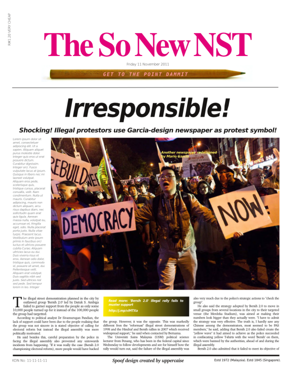
Design icon as protest symbol

|Another spoof NST front page with a cameo role for another Garcia job. spoof design by uppercaise

Continue reading

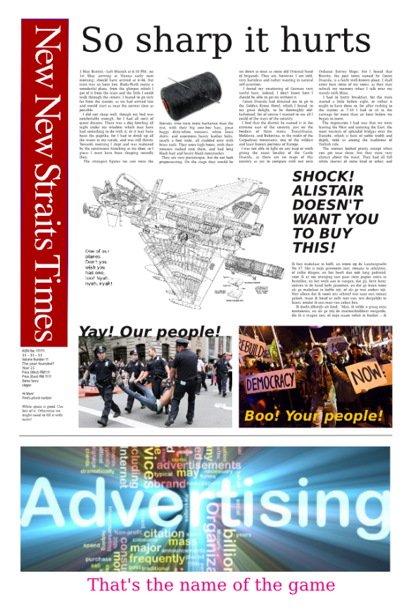
Next: A sharper New NST

The NST changes its looks again on Nov 11. This isn't itSpoof design created by uppercaise with Scribus and Inkscape. Sigh. To think I had to say that.

Continue reading

Coming soon: yet another New New New NST

Altogether New NSTSigh Spoof design created by uppercaise with Scribus and Inkscape. (I had an hour to spare.) Sigh.

There’s yet another New New Straits Times coming next week. The phrase is so trite you’d think NST Marketing would seek something fresh. It’s only been used since 1979, after all, and the paper’s been through three re-incarnations, each one trumpeted as being NEW! Never mind, no one remembers these things anyway. So long as it looks different from the last one.

Keep your pencils sharpened for Nov 11, it’s you-know-who’s favourite number.


Big ❤ — Milton Glaser on his heart symbol

I did the bloody thing in 1975 and I thought it would
last a couple of months as a promotion and disappear.

Milton Glaser,
the graphic designer who submitted his now-iconic rebus in 1976 to New York State tourism free of charge.
Continue reading

How big is Malaysia in the world?

Or: How many countries can fit into Africa?

This wonderful infomation graphic by Kai Krause, which has been circulating for the past week, puts the size of countries into real perspective, and again demonstrates the power of images to convey information (backed up with the data at hand, of course).

» Full size image: 2,482 pixels x 1,755px [417kB]

By comparison

Malaysia is listed 66th of the world’s 100 largest countries, in a table that accompanies the map. That ranking seems slightly misleading for comparative purposes as most other countries comprise single land masses with little bits tagged on (except archipelagoes).

The 10 largest countries: Russia, Canada, China, United States, Brazil, Australia, India, Argentina, Kazakhstan, Sudan

Asean countries: Indonesia (16), Myanmar (40), Thailand (50), Vietnam (65), Malaysia (66), Philippines (72), Laos (83), and Cambodia (89).

Malaysia’s total landmass 329,847 sq km (127,355 sq mi) comprises:

Peninsula: 131,598 sq km (50,810 sq mi)
Sarawak: 124,450 sq km (48,050 sq mi)
Sabah: 76,115 sq km (29,388 sq mi)

Figures from Wikipedia

Separately, the peninsula would rank 96th and Sarawak 98th. Sabah would not fit into the top 100.

(Kai Krause is the creator of Kai’s Power Tools, a toolkit for Photoshop, and other image-bending stuff like Bryce and Power Goo.)

How the ringgit can get world top 5 status

Design a new currency symbol and get into top ranking


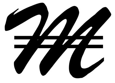
My idea of a symbol for the ringgit

A currency symbol for the ringgit could look like this. A few strokes away from top world-ranking.

It’s so irksome having to type “RM” for amounts of money when writing an article or report. And besides, “RM” is visually very ugly in headlines, and also takes up the space of three characters. So let’s design a new symbol and make life simpler at the keyboard.

Essence of Malaysian life captured in a few strokes

A proposed ringgit symbolHere’s my contribution. This new symbol for the ringgit captures the essence of Malaysian life, showing constant motion, all action, things moving all the time, in a state of flux, going up and going down.
Continue reading